


If you know me, you know my dad and I are periodically design buds. I design, he puts in his two cents (whether it’s asked for or not), and then he builds said design…sometimes I help. But actually designing a full home, MY HOME nonetheless, would likely have us saying, “love you, mean it, but we need a long break from each other.” So when I read this article on Architectural Digest about how a mother, son, and sometimes dad (and a bit of brother) all collaborated on this utterly stunning and soulful home, I was in awe. That likely says more about my father/daughter dynamic but regardless I thought I was incredible. Clearly, there’s a mutual taste and general respect for each other’s opinions:)
To be fair, the mother, Shari Creed, is a very talented decorator and has clearly taught her kids to love and appreciate design. Parent hack? She’s actually been helping her son, Brandon Creed (manager of little-known artists like Lizzo, Troye Sivan, and Mark Ronson) with his apartments since his college. What a perk! My favorite quote from the article is from when Brandon showed his parent’s the house she called it “an absolute dump” but “could see past that.” That is absolutely something my dad would say. No holding back when it’s family! Amirite??


But let’s get into this house and into the nitty-gritty of why it’s so cool and special. You know when we call something “special” we mean business🙂 This entryway was Shari’s favorite space to design and it’s easy to see why. The first piece I am blown away by is that custom door. I don’t think I’ve really seen anything like it before. It could have easily been a cold ultra-modern door but instead, it has so much visual depth and texture from the warmth and orientation of the wood pieces. It was important to Brandon for the overall feeling of this home to be zen and that is exactly the emotion you feel looking at this entrance. I think the organic boulders mixed with the contrasting shades of the concrete walls, AND the wood floor inlay just look so cool and organic. Fun fact – those french urns are from his grandfather’s farm! A fun and unexpected design choice that makes it feel more lived-in and personal. And yes that’s a turtle pond with a real turtle:)

I should let you know that the art in the house is incredible and brings so much color and playfulness. Brandon has been collecting art for years. Also doesn’t hurt that his brother is an art advisor who lets him in on who are the up-and-coming artists. Looks like I’ll be calling my bother to step up his game… But truly this art makes the room come alive and is perfectly complemented by all those cool textures and fabrics! First, you see the sheepskin pelts draped over those awesome custom linen benches. Then all of a sudden you notice the tan boucle chair cushions until…BAM the chair’s seats are a rich dark brown wicker. Heart be still!
Let’s also notice the balance of shapes. There are lots of rectangles and squares (ie benches, table, credenza, art). But then you notice the rounded shapes (ie the sheepskins, captain chairs, table decor, and of course those quietly awesome pendants). Oh and I literally just noticed that incredible burgundy rug that completely grounds the space and the little dog statue outside. GAH, this house is awesome.

There are almost too many cool things in this room to point out but I will do my best to keep it brief(ish) so that you can finish this article before dinnertime. The first thing I noticed, aside from the rich warm mid-century modern color palette, was that there’s a lot of furniture in this space. In case you don’t know, we have a whole design mistake post about “too much furniture”. However, this is an example of when this rule is meant to be broken. All the pieces make it feel so inviting that you can just plop down on any and every surface. Color-wise, why this room is so easy on the eyes is because everything has a warm undertone (even the sheepskin chairs, the sheep ottoman, and the white wall color). Also, everything is relatively tonal with just a couple pops of greens and blues. Now take a look at that unexpected small art and pendant placement over the fireplace! Since the room is so colorful (something that Brandon said was a little outside his comfort zone), they only needed to add a couple of small pieces of art to balance the room. Placing them in the same orientation that mimics the shape of that sick custom firewood holder is just icing on the cake. And let us not forget to give love to that beautiful tree that gives the room some “actual” life and a ton of height. Lastly, the choice to make the beam black also brings your eye up and visually balances the space. Ok, ok, I’ll move on now.

THIS ISLAND. Can you handle how cool that is? The multi-height island is currently on-trend but is totally classic in this space. It looks like it would be a joy to cook and hang out in (while someone else cooks…my preferred way to spend time in a kitchen:)) As the observer, sitting on those stools would make you feel like you’re really part of the action. I guess that’s how most people feel sitting at a kitchen island, but there’s something cozier about this setup. Also, those stools are incredible and the tone of the wood speaks perfectly to the MCM style.
Let’s talk a little more about the function. While we can’t see the left wall, I feel like there are some wall cabinets as well as a ton of storage in the island. But look at the exposed storage on the oven wall. Those little shelf racks make cooking and grabbing a cup of coffee super easy. Plus it looks and feels more lived-in which I love. In addition, that pot rack with the mix-matched/colorful cookware, as well as the copper pots on top of the wall ovens (and the pop of green on the stools) make this kitchen not just another pretty white and wood kitchen. Big fan. Lastly, something that’s an unexpected 10/10 for me are those stainless steel appliances. They just feel right for the style of this home. Oh, and those skylights really give that beautiful airiness we all love.

If you are looking at the kitchen, just turn around and you will see this perfect little breakfast nook. Again, here Shari and Brandon made the unexpected design choice of using this European antique table and chairs set. But there’s a story and it’s the best. This set was his grandparent’s and was the dinner table he grew up eating meals with this family at. Now, four generations later, he gets to eat at it with his son. Told you it was the best.
So beyond the dining set, that gallery wall is pretty spectacular (yep, that’s a real Warhol). But other than the famous artists, look at how balanced and varied it is. The Warhol is the anchor, then you have the slightly smaller and only black-framed piece to the lower right, followed by that 3-D clear case of small sculptures to the upper left. Then to the upper right is a modern smaller horizontal piece followed by a piece on the lower left that I can’t tell what it is aside from also having a white frame. Oh and notice how they played with uneven spacing! Lastly, note the mix of European antique-style pitchers next to a tiered display of Warhol soup mugs. It’s pretty freaking fun. So is that orange pendant:)
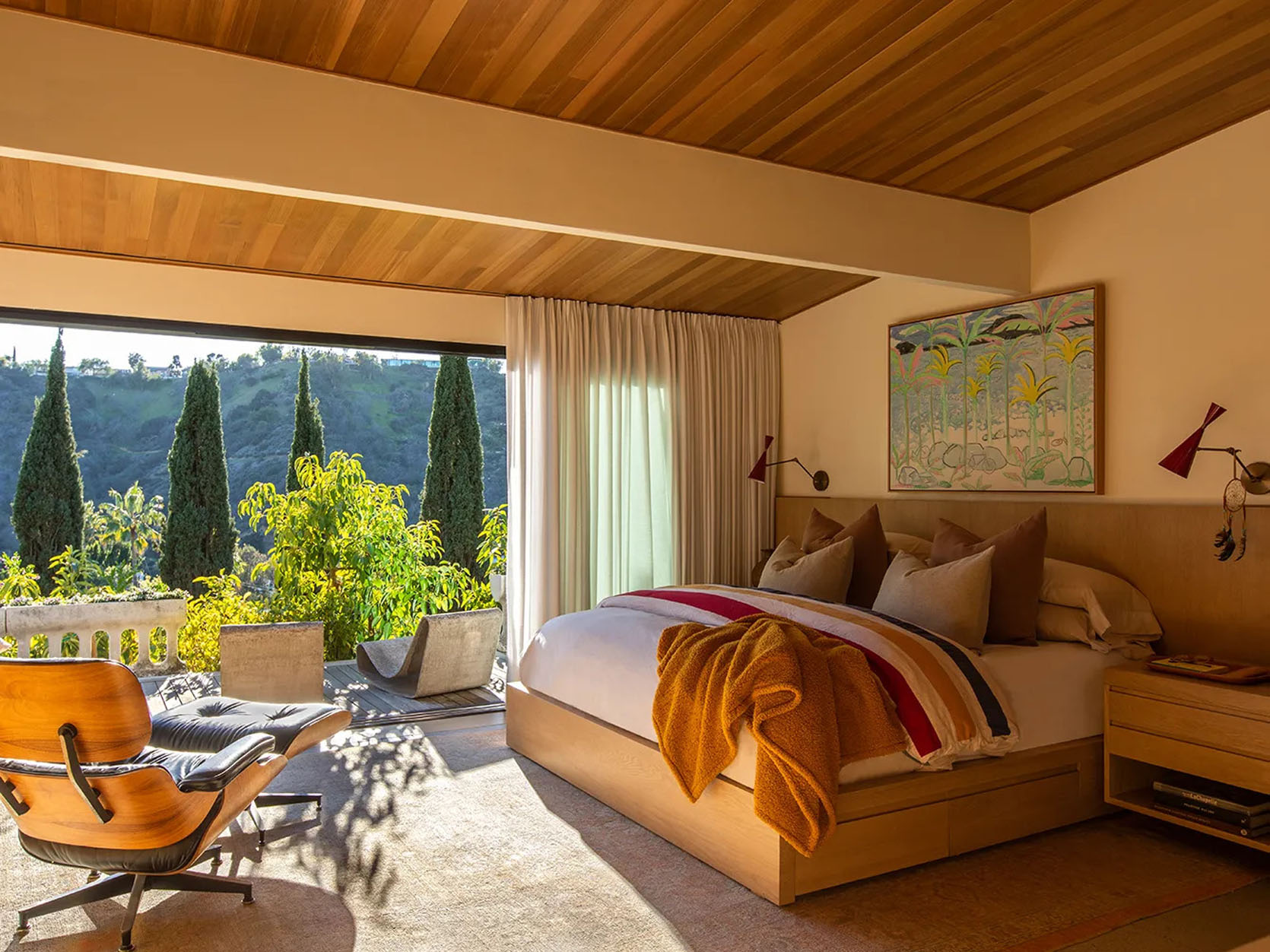
This is Brandon’s bedroom and it’s an oasis. Given that he said this house is a little more color than he typically goes for, it’s no surprise that his primary suite is more on the neutral side. I think we can all agree that the view is the real showstopper here, but I love those concrete lounge chairs and wildly cool sconces. Actually, this space was an unfinished ’90s addition. Not anymore!

And here is the primary bathroom. If you are asking yourself, “is the vanity glowing?” you are correct. He said that this bathroom was inspired by his trips to Israel which you totally get by all the light tones and natural materials. My favorite part is how they carried the slatted wood into the vanity and drawer.
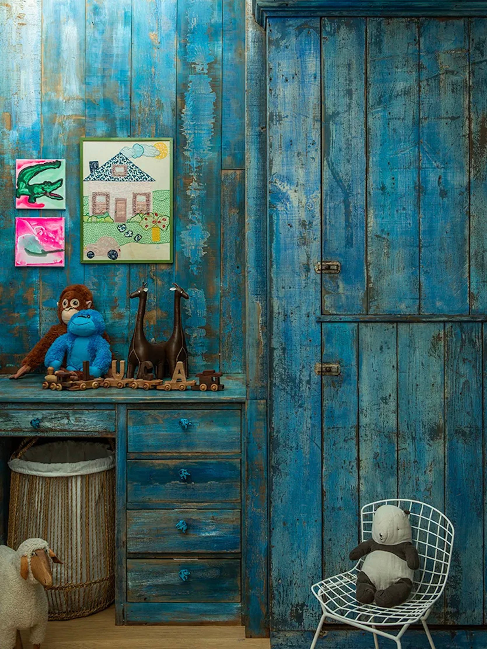
Now, this is his son’s room and I really love this distressed electric blue! The article said that they were inspired by a cupboard from Nickey Kehoe. Another design choice that you may not think would be a fit for an MCM home but the color feels so fresh and the design is awesome. Yet another example that rules need not apply when you have a strong vision.


Ok, I think this is my actual favorite space/spaces. All the art makes my eyes light up. I mean look at that huge Mark Hagan piece! It’s spectacular. What is also so special about these spaces is that the stone flooring and yellow pendants make them feel like one space, interconnected despite the sliding door. Then you have that insane Willy Guhl-inspired pond and firepit! It’s all too good. One last tidbit. I really love how they chose to paint the overhang on the right gray to contrast the black of what is probably the addition(?). It just makes it look more interesting. A little stone turtle also makes things look more interesting:)

We’ve made it to the pool and for some reason clicking my red heels three times isn’t transporting me. Very annoying because what a beautiful place to hang out at. I love the green and orange tiles because they feel so true to the era of the home (just wait for the next photo). This is clearly an “entertaining home” since there are not one but two wine racks…outside! I love that they chose to make them different sizes. I also love the continuation of the boulders from the entry to the backyard and how great is it that the left posts are a different color and finish than the right ones. It helps to make a lounge zone and a bar zone.

Y’all we’ve made it to the end and I’m ending with one of the most fun spaces…the outdoor bathroom. Yes, this beauty is for the OUTDOORS. But honestly, if you can have a pool bathroom why not go bold? The tile choice is obviously continued from the outdoor bar and all those natural materials (ie stone sink and reclaimed wood) speak to the outdoors. But then that great mirror and metallic fixtures make it so it feels modern.
So that’s it! Clearly, this is someone with a much larger budget than probably most, if not nearly all of us, will ever have. However, there are a ton of awesome and interesting design choices that we can all learn from and maybe even incorporate into our homes, on our smaller budgets. But now let’s talk about your favorite parts! What did you love? What maybe wasn’t for you? Are you inspired? I hope so.
Love you, mean it.
Opening Image Credits: Design by Shari and Brandon Creed | Built by Design Universal Architects | Photos by Laure Joliet | via Architectural Digest
The post How To Do Mid-Century Modern The “Modern” Way RIGHT From A Famous Music Manager And His Wildly Talented Mother (A True Design Dream Team) appeared first on Emily Henderson.